a few thoughts about
Typescript UI Component

Step 1
The first thing we want to do is establish some basic styles and options for our component. In this case we're building a <Title> component, which will display H1 through H6 tags depending on the props passed. I am also going to add in a few basic variants.
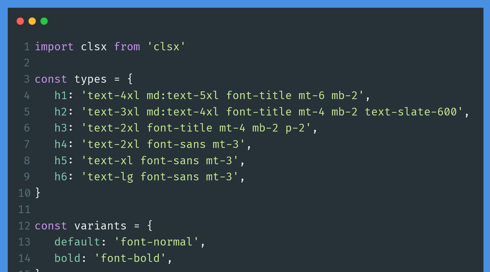
We're going to create two objects. The first will use h1 through h6 as the keys. The key is that these are valid HTML tabs and we will see why a little further down. As a note I'm using Tailwind CSS, but you could use regular CSS classes here too.
const types = {
   h1: 'text-4xl md:text-5xl font-title mt-6 mb-2',
   h2: 'text-3xl md:text-4xl font-title mt-4 mb-2 text-slate-600',
   h3: 'text-2xl font-title mt-4 mb-2 p-2',
   h4: 'text-2xl font-sans mt-3',
   h5: 'text-xl font-sans mt-3',
   h6: 'text-lg font-sans mt-3',
}

const variants = {
   default: 'font-normal',
   bold: 'font-bold',
}
Step 2
With that done, let's setup a TypeScript interface and use those two objects. We're going to take in children which will be the text (or whatever else) we want to display as the title. Then we will take in the type, which is one of the h1 through h6 tags. Here we use keyof typeof types instead of something like string. This will convert the keys from the types object into the only valid input for the type prop. In other words if someone tried to do type='img' they would get a Typescript error.
Why not use h1 | h2 | h3 | h4 | h5 | h6? We definitely could. These 6 options have existed since HTML+ in 1993 and there are no plans to add to them. However if we were using a different list of tags for this then after writing the initial component a new tag might get added at some point. Even with this component a <p> might get added when the design calls for something to look kind of like a title but not be one. But using keyof typeof types then as soon as a new option is added to the types object it is also immediately a valid option to use as a prop.
Of course, all of the above also applies to the variant prop, so we can do the same thing with it. The key difference here is that variant is optional. Lastly we have a css prop which is optional and exists in case there is an edge case where we need to pass some one off CSS to the compoenent.
interface TitleProps {
   children: React.ReactNode
   type: keyof typeof types
   variant?: keyof typeof variants
   css?: string
}
Step 3
With all that done, let's build the whole component. We'll make the variant prop optional with a default value of default. In the JSX we can use the clsx package to make the various class inputs neat.
import clsx from 'clsx'

const types = {
   h1: 'text-4xl md:text-5xl font-title mt-6 mb-2',
   h2: 'text-3xl md:text-4xl font-title mt-4 mb-2 text-slate-600',
   h3: 'text-2xl font-title mt-4 mb-2 p-2',
   h4: 'text-2xl font-sans mt-3',
   h5: 'text-xl font-sans mt-3',
   h6: 'text-lg font-sans mt-3',
}

const variants = {
   default: 'font-normal',
   bold: 'font-bold',
}

interface TitleProps {
   children: React.ReactNode
   type: keyof typeof types
   variant?: keyof typeof variants
   css?: string
}

export const Title: React.FC<TitleProps> = ({
   children,
   type,
   variant = 'default',
   css,
}) => {
   const Type = type as keyof JSX.IntrinsicElements

   return (
      <div
         className={clsx(
            types[type],
            variants && variants[variant],
            css ? css : ''
         )}
      >
         <Type>{children}</Type>
      </div>
   )
}
That's it. Obviously you can adjust the JSX as need to suit the needs of your component. Updating this is simple and the TypeScript use of keyof typeof, while simple, helps to reduce errors on update and make the allowed options for the props super clear.